With feet firmly planted in the design world, Christine is a freelance writer and public relations consultant. She blogs about style, found objects and her European adventures at christinesisson.wordpress.com. Here is her report:
Staged vignettes take the guesswork out of the shopping experience, as customers are able to visualize how they would show merchandise in their homes. Inviting displays like the ones below incorporate merchandise that can easily be mixed and matched—and that look natural, functional and pleasing. Why buy just the sofa, when that end table looks so nice next to it?

Intricate teak and wool animals—more art objects than playthings—seem at home on Canoe’s simple/modern shelving unit. The message? Though they look cute and toy-like, these whimsical, handcrafted items are meant to be displayed front and center.

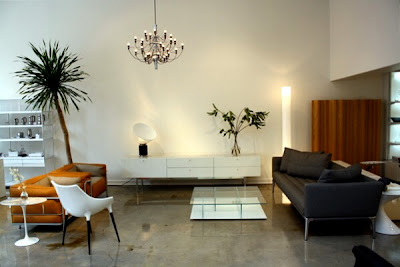
A perfectly decorated living room—complete with sofas, a console, a chair and tables--is staged in one section of Hive Modern. It offers up an aesthetic—modern minimalist—that customers can try on for size. Seeing the whole “look” may also incite indecisive shoppers to buy more than one item.
Be sure to read the other four parts of this series.
Part 1, Effective Retail Displays
Part 2, Retail 101
Part 3, Branded Displays
Part 4. Fixtures.
No comments:
Post a Comment